
I want to share with you my experience building Ionic charts and visualizations.
I will guide you through my mental process, and then show you some code examples on how to use the top three Ionic charting libraries.
Also, we will explore different possibilities to build advanced Ionic charts and visualizations with enhanced user experience.
At first, I was tempted to write a detailed technical tutorial going through the process of:
- How to choose the correct charting library for your use case
- How to use the different Ionic charting libraries that are out there
- How the interaction between Ionic and the charting library works
- What theming capabilities each charting library has
- How to customize the different charts and visualizations with Ionic
- And ultimately, how to fetch data, filter and format to be used in the visualization
But as I started writing this ionic charts tutorial, I realized that wasn’t precisely my approach when I built the different visualizations and charts for our templates (for example: Fully - Angular Admin Template).
Besides all the technical details about the implementation of a chart visualization with Ionic, you have to look at the bigger picture. Realize that the main purpose of visualizations is to help display data in a visual, lively, sexy and summarized way.
A chart is a subset of the different visualizations you can create to tell the story behind the data. It’s also a graphical representation of data, composed of different symbols, such as slices in a pie chart, bars in a bar chart or lines in a line chart.
In particular, when building mobile apps with Ionic (or other frameworks), it’s a good idea to use charts when a simple table won't adequately demonstrate important relationships or patterns between data points.
We can leverage charts and more advanced and customized visualizations to display data and invite the user to further explore a topic inside our mobile app.
There are several chart types to choose from. Some of the most popular ones, that cater to a vast array of common use cases, are the following.
Spark-line charts with Ionic
These mini charts are very useful to summarize a trend. Ideal for those use cases where there’s not much value on expanding all the data points.
Line charts with Ionic
Line charts are helpful when we need to show changes over periods of time. These charts can also be used to compare multiple data sets over the same period of time.
Bar charts with Ionic
The purpose of a Bar chart is to compare different data sets through the height of a bar.
Pie charts and Doughnut charts with Ionic
The main use of Pie charts is to compare the proportions of different categories.
The Doughnut chart is similar to the Pia chart in that it’s also used to visualize a "part-to-whole" relationship between the different pieces. However, it’s considered more efficient than the pie chart because it tends to be easier to read.
Radial, Gauge, Scatter plot charts with Ionic
These charts are less popular, but provide extreme value to specific use cases.
Advanced visualizations with Ionic
You need to think about the story behind your data, and decide upon that.
If you don’t feel a plain chart fits your needs, you should consider exploring other advanced visualizations. There are many examples that mix charts with other elements.
I wrote about all the different things to consider when choosing the best Ionic charting library for your use case in the past.
If you perform a quick search in google, you will find many Angular charting libraries. They all seem to be good choices, and you may be tempted to tie-break the decision by checking which charting library has the most stars on GitHub or an active community behind it.
Unfortunately, there’s more to the decision.
- Are you looking for an open source chatting library, or can you afford paying a license?
- What underlying technology best fits your charting use case? SVG or Canvas?
- Does the charting library work properly with Ionic?
- Is the team behind the charting library actively involved on the project or is a dying repo on GitHub?
- Your visualization use case can be implemented with the charts and elements provided by the Ionic charting library? Or the library doesn’t provide the chart you are looking for?
- How good are the documentation and code samples provided by the charting library?
- Does the charting library enable great customization? Do you have in mind any custom interaction? Hovers, clicks, loaders or maybe merge the chart with some HTML to enhance the overall visualization.
- How are you going to fetch data for the chart? Are you also considering adding filters to your data source?
- Is it easy to configure and extend the implementation of the chart?
- Are the charts and visualizations responsive? Do they fit properly on a mobile screen?
No need to repeat myself, you can read my post with the full explanation about the different aspects to consider when choosing a charting library.
After analyzing the different Ionic charting libraries available. I choose my top three based on both SVG and Canvas, to provide a wide range of options for the different use cases that may arise when building an Ionic app.
Without further ado, here are our top three picks in order of preference:
| Charting Library | Technology | Health | Configuration | ||
|---|---|---|---|---|---|
| Options | Effort | ||||
| ngx-echarts | Based on ECharts | Canvas | Up to date | Wide options | Easy (*1) |
| ng2-charts | Based on Chart.js | Canvas | Up to date | Less options | Easy (*1) |
| ngx-charts | Based on D3.js | SVG | Up to date | Wide options | Difficult (*2) |
(*1) Through JSON configuration object
(*2) Through declarative inputs and SVG elements
If you want to read the in depth analysis where I explore the characteristics of each charting library and both the pros and cons, I suggest you read my previous post about Building Charts with Angular.
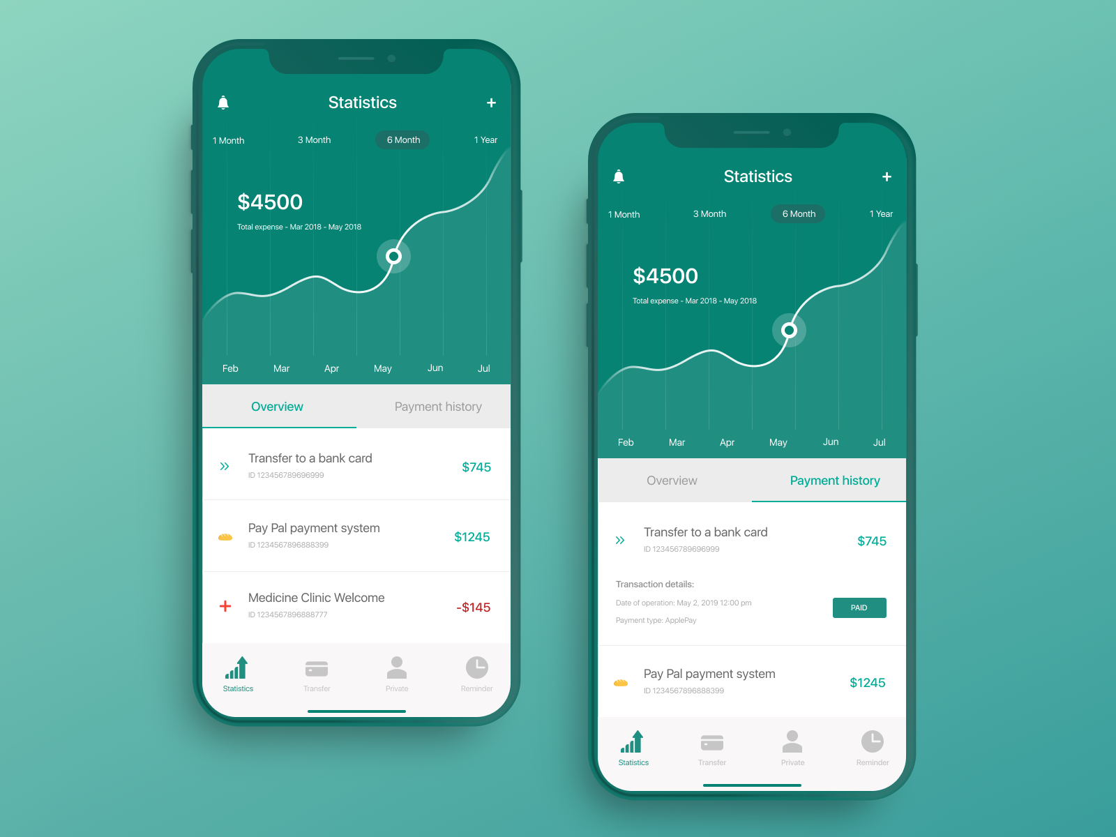
Building a line chart with Ionic
I will be building one basic yet complete Ionic chart using the top three Ionic charting libraries.
The chart example features a line chart with different data sets, and some Ionic controls to interact with the chart. These controls can be used to filter data, toggle the different data sets shown in the chart and dynamically change some properties of the visualization.
By default almost every charting library comes with built-in controls to interact with the chart. This is not bad at all, but when designing a mobile app you can greatly improve the user experience if you own the different pieces of the UI.
That’s why I believe it’s important to show you how to interact with the chart using Ionic controls instead of the ones built-inside the charting library.
ngx-echarts is an open source Angular library built on top of ECharts. The customization possibilities and the documentation are the two aspects I like the most about this Angular charting library. You can define a wide set of configuration options to customize every single detail of the chart.
On top of that, it provides a beautiful API to interact with the chart instance. Enabling you to build more advanced visualizations.
Also, its documentation is super complete, featuring lots of interactive examples with code playgrounds included.
The configuration for this charting library is straightforward, just add a JSON configuration object to the Ionic page component with your desired options. There’s also detailed documentation with all the different configuration options available.
lineChartOptions: EChartsOption = {
  tooltip : {
    trigger: 'item',
    formatter: '{c}'
  },
  xAxis: {
    type: 'category',
    axisLine: {
      show: false
    },
    axisTick: {
      show: false
    },
    data: CHART_LABELS,
    splitLine: {
      show: false
    }
  },
  yAxis: {
    type: 'value',
    axisTick: {
      show: false
    },
    splitNumber: 4,
    axisLine: {
      show: false
    }
  },
  grid: {
    left: '10%',
    right: '0%'
  },
  series: [
    {
      id: 'earnings',
      name: 'Earnings',
      type: 'line'
    },
    {
      id: 'revenue',
      name: 'Revenue',
      type: 'line',
      lineStyle: {
        color: '#CCC',
        type: 'dashed'
      }
    }
  ]
};
Then the markup in your HTML file would be as simple as:
<div echarts [options]="lineChartOptions" (chartInit)="onChartInit($event)"></div>
For the ECharts line chart, the data has to be in this format under the series property of the configurations object:
lineChartOptions: EChartsOption = {
  …
  series: [
    {
      id: 'earnings',
      name: 'Earnings',
      data: [680, 932, 901, 934, 1290, 1330, 1320],
      type: 'line'
    },
    {
      id: 'revenue',
      name: 'Revenue',
      data: [620, 999, 1003, 1200, 1100, 1200, 1500],
      type: 'line',
      lineStyle: {
        color: '#CCC',
        type: 'dashed'
      }
    }
  ]
};
I typically hard code some dummy data while I’m working on the visualization. Once the UI and user experience is polished, I start working on the services to fetch and format the data correctly.

Ionic line chart using ngx-echarts
ng2-charts is also an open-source Angular library, but it's based on Chart.js. The library is maintained by the Valor Team (if you are an Angular Bootstrap developer, you may know them for their popular ngx-bootstrap library).
This Angular charting library features one directive (baseChart) that can be instantiated with any of the eight types of built-in charts: line chart, bar chart, radar chart, pie chart, polar area chart, doughnut chart, bubble chart and scatter plot.
The baseChart directive provides some properties to configure and customize the chart. It's worth mentioning that these properties are constrained by the configuration options provided by Charts.js (which are limited compared to ECharts).
In the Ionic page component, you need to set up some JavaScript objects for the different elements of the chart (labels, legend, data sets, etc.).
public lineChartOptions: ChartConfiguration['options'] = {
  responsive: true,
  layout: {
    padding: {
      top: 0,
      left: 0,
      bottom: 0,
      right: 0
    }
  },
  scales: {
    x: {
      axis: 'x',
      grid: {
        drawBorder: false,
        display: false
      },
      ticks: {
        display: true
      }
    },
    y: {
      axis: 'y',
      min: 0,
      grid: {
        drawBorder: false,
        display: true,
        drawTicks: false
      },
      ticks: {
        padding: 10
      }
    }
  },
  plugins: {
    legend: {
      display: false
    }
  }
};

public lineChartType: ChartType = 'line';
Then, you can reference those objects in the markup like this:
<canvas baseChart [data]="lineChartData" [options]="lineChartOptions" [type]="lineChartType"></canvas>
In this case, for the line chart we need to set our data with this format:
this.lineChartData = {
  labels: ['Mon', 'Tue', 'Wed', 'Thu', 'Fri', 'Sat', 'Sun'],
  datasets: [
    {
      label: 'Earnings',
      data: [980, 232, 601, 434, 1090, 1230, 1720],
      borderColor: '#035388',
      backgroundColor: 'rgba(3,83,136,0.4)'

    },
    {
      label: 'Revenue',
      data: [120, 699, 1203, 1700, 1200, 1100, 1900]
    }
  ]
};
Ionic line chart using ng2-charts
Like the previous ones, the ngx-charts charting library is also open source. But, in contrast to the previous ones, it has a declarative approach and is based on SVG elements and the powerful D3.js visualization library.
Specifically, it uses Angular to render and animate the SVG elements with all of its binding and speed goodness, and uses D3.js for the excellent math functions, scales, axis and shape generators, etc.
This leaves out of the equation the possibility to render D3.js visualizations using canvas. ngx-charts is all about SVG.
The bright side of having Angular do all the SVG rendering is that it opens endless possibilities the Angular platform provides such as Ahead Of Time compilation, Server Side Rendering, etc.
In terms of customization, ngx-charts provides great flexibility as it exports all the components and helpers used as building blocks for the charts. Things like legends, axes, dimension helpers, gradients, shapes, can be directly imported into your application and used in your angular components. This allows you to combine them and build custom charts that implement use cases that the default library's charts do not support.
I have to say that although this level of customization is great, you still need to deep dive into the different chart primitives and interact directly with the SVG nodes (take for example this custom chart source code). This is considerably harder to do than customizing a configuration JSON object like we saw in the previous two charting libraries.
This charting library also provides easy to customize components for the most popular chart types (line charts, bar charts, pie charts, heat maps, polar/radar charts, gauge charts, and bubble charts among others).
This way you don’t have to struggle with the different chart primitives (legends, axes, gradients) yourself. You can set the different configuration options using a JSON object like this:
colorScheme = {
  domain: ['#035388', '#40c3f7', '#b3ecff', '#52606d', '#127fbf', '#9aa5b1']
};

lineChartOptions = {
  showXAxis: true,
  showYAxis: true,
  showLegend: false,
  showGridLines: true,
  showXAxisLabel: false,
  showYAxisLabel: false,
  legendPosition: 'right',
  autoScale: false,
  roundDomains: true
};
And the markup in your HTML file would be as simple as:
<ngx-charts-line-chart
  [scheme]="colorScheme"
  [results]="lineChartData"
  [legendPosition]="lineChartOptions.legendPosition"
  [xAxis]="lineChartOptions.showXAxis"
  [yAxis]="lineChartOptions.showYAxis"
  [legend]="lineChartOptions.showLegend"
  [showXAxisLabel]="lineChartOptions.showXAxisLabel"
  [showYAxisLabel]="lineChartOptions.showYAxisLabel"
  [roundDomains]="lineChartOptions.roundDomains"
  [autoScale]="lineChartOptions.autoScale"
  [curve]="lineChartOptions.curve"
  [showGridLines]="lineChartOptions.showGridLines">
</ngx-charts-line-chart>
In this case, the data for the line chart must follow this format:
lineChartData = [
  {
    name: 'Earnings',
    series: [
      {
        value: 680,
        name: 'Mon'
      },
      {
        value: 932,
        name: 'Tue'
      },
      {
        value: 901,
        name: 'Wed'
      },
      {
        value: 934,
        name: 'Thu'
      },
      {
        value: 1290,
        name: 'Fri'
      },
      {
        value: 1330,
        name: 'Sat'
      },
      {
        value: 1320,
        name: 'Sun'
      }
    ]
  },
  {
    name: 'Revenue',
    series: [
      {
        value: 620,
        name: 'Mon'
      },
      {
        value: 999,
        name: 'Tue'
      },
      {
        value: 1003,
        name: 'Wed'
      },
      {
        value: 1200,
        name: 'Thu'
      },
      {
        value: 1100,
        name: 'Fri'
      },
      {
        value: 1200,
        name: 'Sat'
      },
      {
        value: 1500,
        name: 'Sun'
      }
    ]
  }
];
Ionic line chart using ngx-charts
As mentioned before, all the three charting libraries use either JavaScript or JSON objects to configure and handle the data displayed in the visualization.
We are going to add some Ionic controls to update the data displayed in the visualization.
For this example, I created a simple service that fetches and filters the data, and also formats the data to match the requirements of the three different Ionic charting libraries. For simplicity, I will be using a file with hard-coded dummy data as the data source.
The HTML for the Ionic form controls is the same in all three charting examples:
<form [formGroup]="chartControlsGroup">
  <ion-list>
    <ion-item>
      <ion-label>Earnings</ion-label>
      <ion-checkbox slot="end" formControlName="earningsData"></ion-checkbox>
    </ion-item>
    <ion-item>
      <ion-label>Revenue</ion-label>
      <ion-checkbox slot="end" formControlName="revenueData"></ion-checkbox>
    </ion-item>
    <ion-item>
      <ion-label>Smooth</ion-label>
      <ion-toggle formControlName="smoothLine"></ion-toggle>
    </ion-item>
    <ion-item>
      <ion-label>Data period</ion-label>
      <ion-select formControlName="dataPeriod" placeholder="Select a period of time for the data">
        <ion-select-option value="lastWeek">Last Week</ion-select-option>
        <ion-select-option value="thisWeek">This Week</ion-select-option>
      </ion-select>
    </ion-item>
  </ion-list>
</form>
Ionic controls to interact with the charts
I also added a mechanism to listen to changes in the form controls values. This will enable us to dynamically update the chart accordingly.
While the mechanism works the same way in all three examples, the implementation varies a little because each charting library has different ways to update the data shown in the visualization.
Update the line style property of the chart based on the toggle control
this.chartControlsGroup.get('smoothLine').valueChanges.subscribe(isSmooth => {
  console.log('smoothLine', isSmooth);
  …
});
Update the chart data based on the selected date period and the values of the other controls:
this.chartControlsGroup.get('dataPeriod').valueChanges.subscribe(dataPeriod => {
  console.log('dataPeriod', dataPeriod);

  // ? Check what series we should show in the chart
  const showEarnings = this.chartControlsGroup.get('earningsData').value;
  const showRevenue = this.chartControlsGroup.get('revenueData').value;

  const dataCategory = (showEarnings & showRevenue) ? 'all' : (showEarnings ? 'earnings' : (showRevenue ? 'revenue' : null));

  if (dataCategory !== null) {
    const chartData = this.chartsDataService.getData(dataPeriod, dataCategory, 'ngx-echarts');

    …
  }
});
And finally toggle and update the data of the different data sets:
this.chartControlsGroup.get('earningsData').valueChanges.subscribe(toggleEarningsData => {
  console.log('toggleEarningsData', toggleEarningsData);

  // ? Check what period of data we should show in the chart
  const dataPeriod = this.chartControlsGroup.get('dataPeriod').value;

  const earningsData = (toggleEarningsData) ? this.chartsDataService.getData(dataPeriod, 'earnings', 'ngx-echarts').data : [];
});

this.chartControlsGroup.get('revenueData').valueChanges.subscribe(toggleRevenueData => {
  console.log('toggleRevenueData', toggleRevenueData);

  // ? Check what period of data we should show in the chart
  const dataPeriod = this.chartControlsGroup.get('dataPeriod').value;

  const revenueData = (toggleRevenueData) ? this.chartsDataService.getData(dataPeriod, 'revenue', 'ngx-echarts').data : [];
});
Use your imagination to combine different form controls to filter the data and elements shown in the chart.
Different mechanisms to update the charts
As I mentioned before, each charting library has its own api and methods to update configuration options and data.
To be completely honest with you, this was one of the trickiest tasks I faced when building this demo and tutorial.
While you can re-assign the JavaScript options object (lineChartOptions: EChartsOption) to update the chart, the ngx-echarts library has a specific method to update properties.
We first need to get the instance of the chart and then call the setOptions() method when needed.
Get ECharts instance:
echartsInstance: ECharts;

onChartInit(chart: ECharts) {
  this.echartsInstance = chart;
}
Once we have the chart instance we can safely update the options configuration:
this.echartsInstance.setOption({
  series: [
    {
      id: 'earnings',
      data: [680, 932, 901, 934, 1290, 1330, 1320]
    }
  ]
}); The ng2-charts library does not provide a direct way to update configuration options or data. We have to rely on updating the JavaScript objects references (lineChartData: ChartData<'line'> and lineChartOptions: ChartConfiguration['options']) and then call the update method of the chart instance.
So, first we need to get the instance of the chart using the Angular ViewChild:
@ViewChild(BaseChartDirective) chartInstance?: BaseChartDirective;
Then, every time we update the data, we need to call the chart instance update() method:
this.lineChartData.datasets[1].data = [620, 999, 1003, 1200, 1100, 1200, 1500];

this.chartInstance?.update();
Chart options can be changed without calling the update method:
this.lineChartOptions = {
  ...this.lineChartOptions,
  elements: {
    line: {
      tension: isSmooth ? 0.4 : 0
    }
  },
};
Additionally, to hide data sets, we can call the hideDataset() method instead of updating the data set with an empty Array:
this.chartInstance?.hideDataset(1, true);
ngx-charts handles all the rendering of the SVG elements through Angular itself. Thus you need to update the different javascript objects (lineChartOptions and lineChartData) in order to see the changes in the visualization.
Easily override the chart options object using the spread operator:
this.lineChartOptions = {
  ...this.lineChartOptions,
  curve: isSmooth ? curveNatural : curveLinear
};
Use the same technique to update all the data sets or just one in particular:
this.lineChartData = this.chartsDataService.getData(dataPeriod, dataCategory, 'ngx-charts');

this.lineChartData[0] = {...this.lineChartData[0], series: earningsData};As you may know, there are many ways and different technologies to build backend implementations and feed data to our frontend.
Get dummy data from a simple Angular Service
For this tutorial I wanted to keep it simple. So I created a basic Angular service to fetch hard coded data from a file. The service has a method that filters data by category and time period and applies the correct format to the data to fit the different charting libraries requirements.
You can manipulate and transform the data in multiple ways with JavaScript functions and also some RxJs operators.
You need to be ingenious about how to format the data and take into consideration what mechanisms does the charting library provide to update the configuration options and the data.
Get data from a Database or REST API
In the previous step we used some hard coded dummy data for the chart visualization. This is not the typical use case.
Most definitely you will need to pull data from a database, and depending on your use case, you may even require real time data. In this case you will need to set up a pulling mechanism to get fresh data periodically or use a real time database like Firebase.
I won’t go into much detail because that’s not the intention of this tutorial. Besides, we have already written extensive tutorials about REST APIs previously:
- Learn how to build a MEAN stack application with Angular
- Build a complete mobile app with Ionic Framework - Data Integration
- Different strategies to fetch data from REST APIs and Serverless platforms like Firebase
Now that you have an idea of the process of building any Ionic chart visualization, let’s explore some ideas to build advanced use cases.
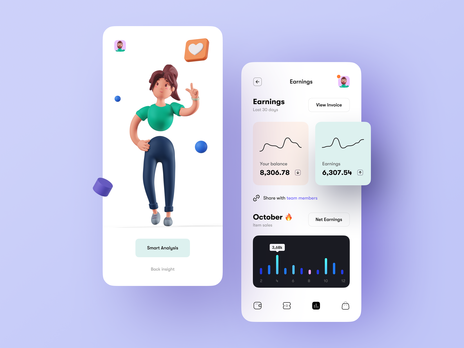
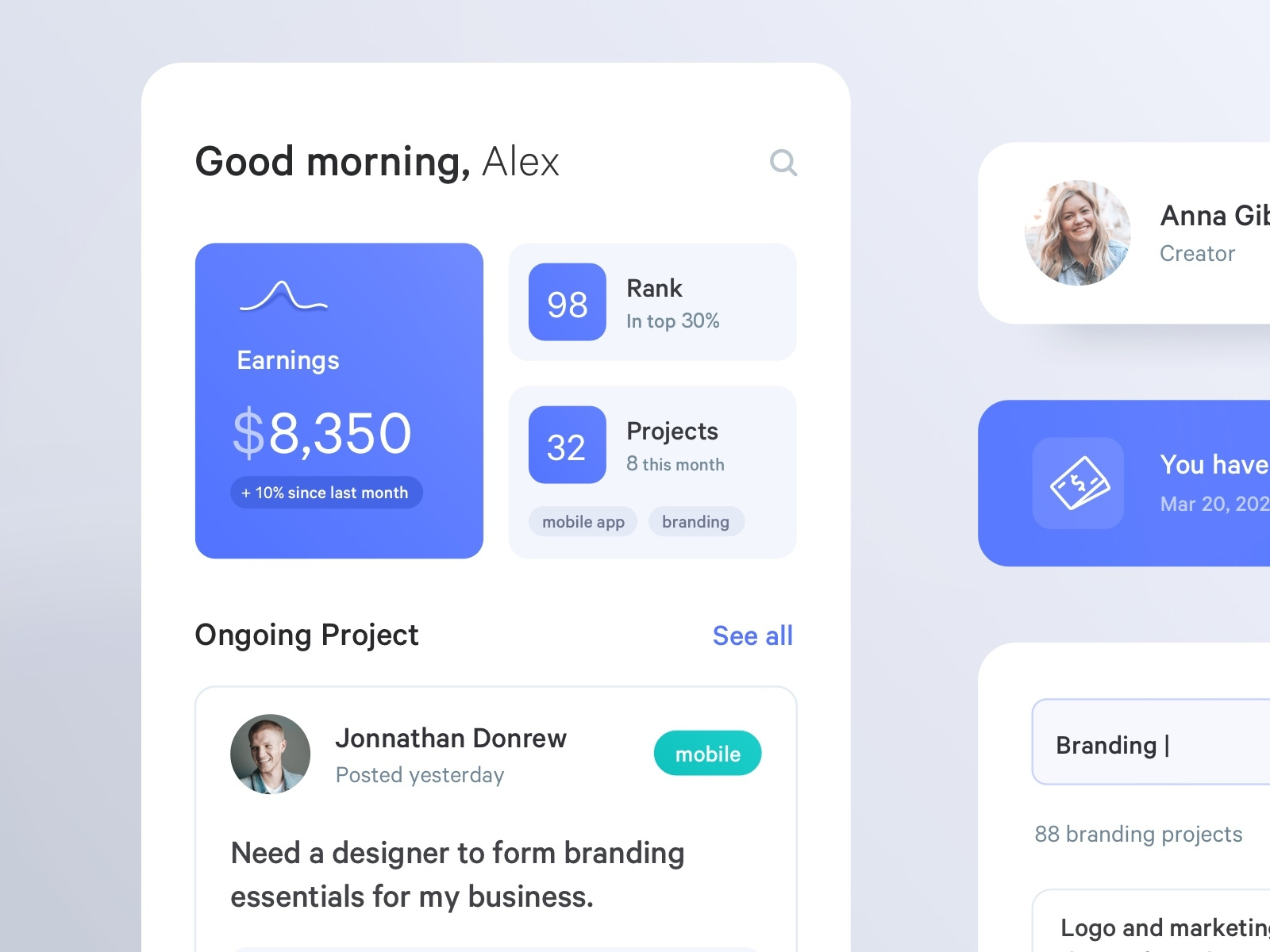
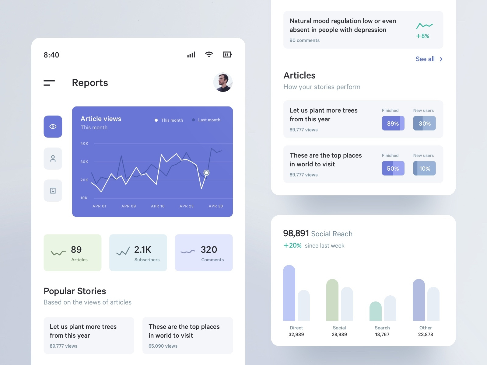
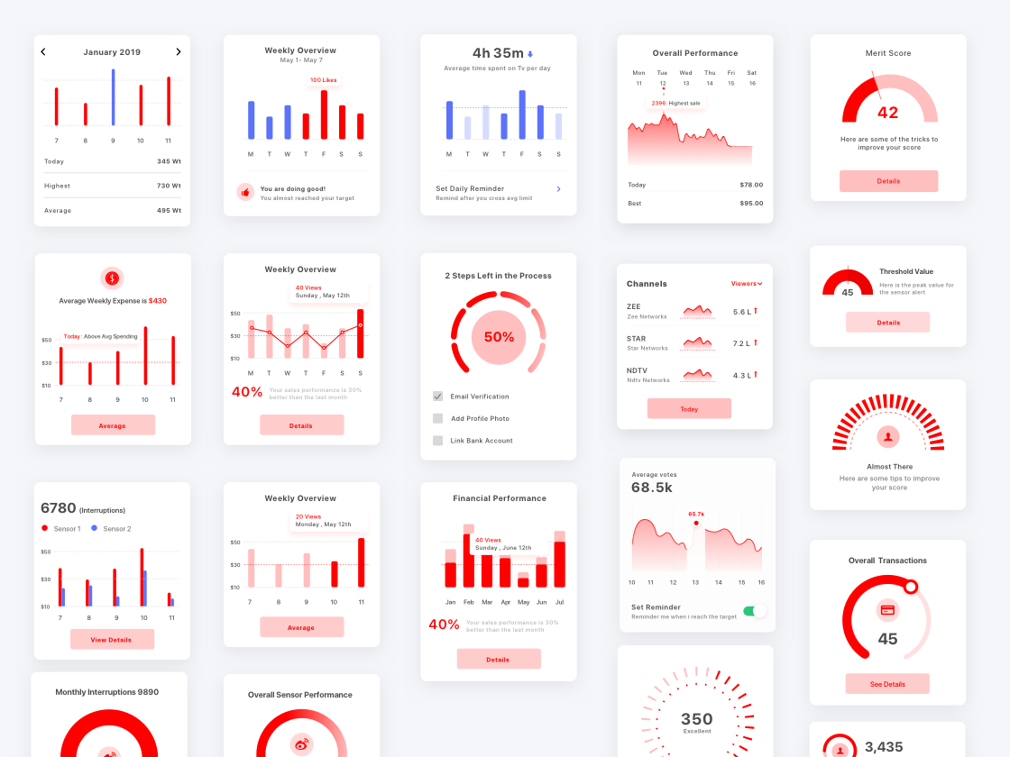
Sometimes all you need is just the chart. A minimal visualization to present some data or insight. But, to be honest, to excel user experience and achieve a great design, you will need a more advanced visualization.
I will do my best to categorize the different ways you can customize and enhance your charting or visualization component.
Designing chart visualizations vary from desktop to mobile screens.
When designing a desktop dashboard, one can use all the screen space available to build a complex visualization with different interactions and widgets that enhances the user experience of the information presented to the user.
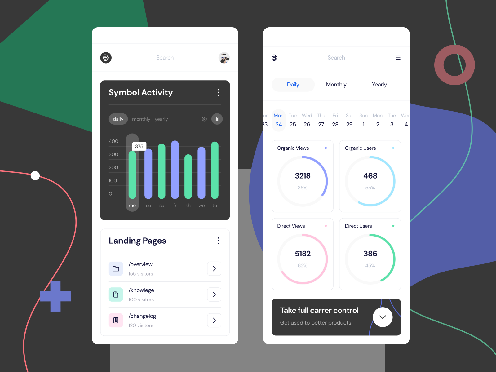
In mobile devices we have considerably less screen space to utilize. That pushes us to oftenly merge charts with other elements in order to better explain the data to the user.
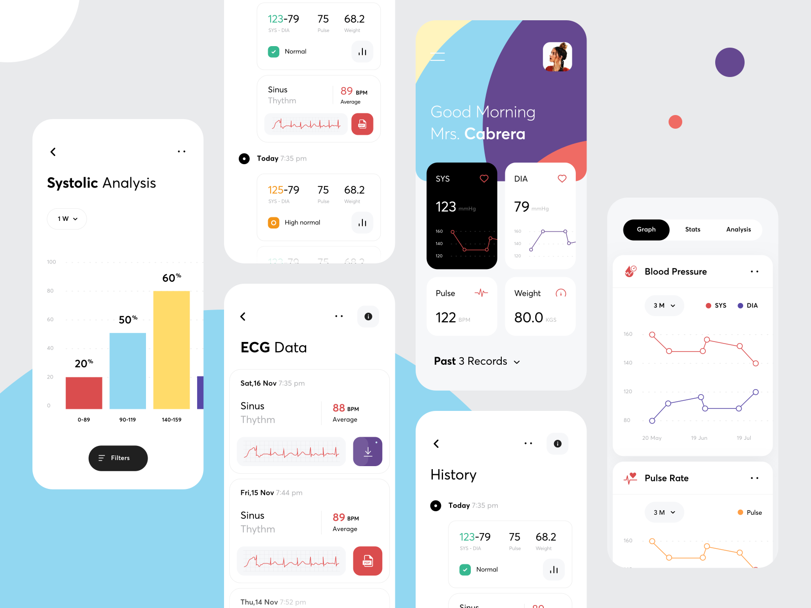
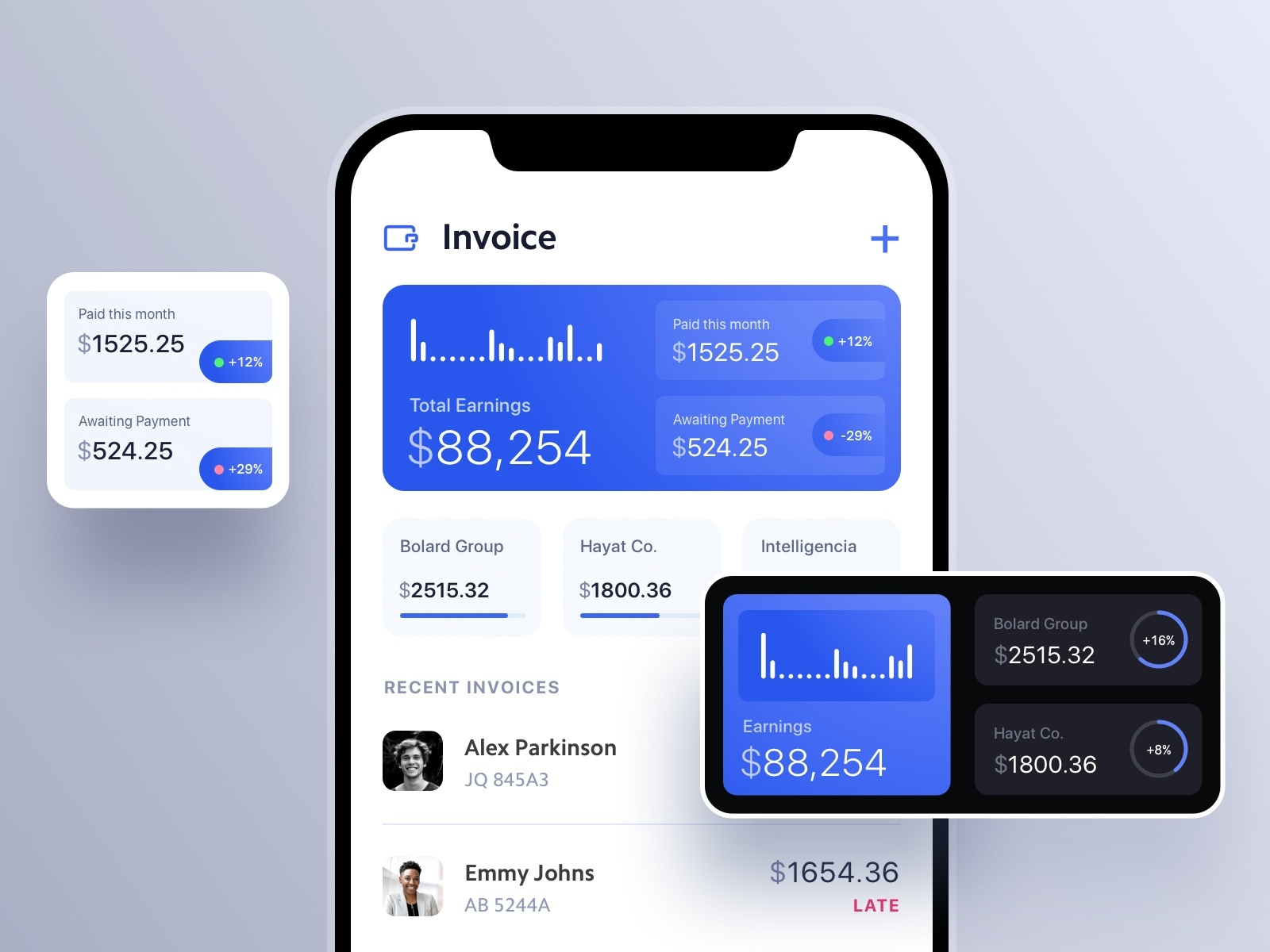
Adding tables or lists next to our chart visualizations allow us to present complementary information and improve the usability of our visualization screen.
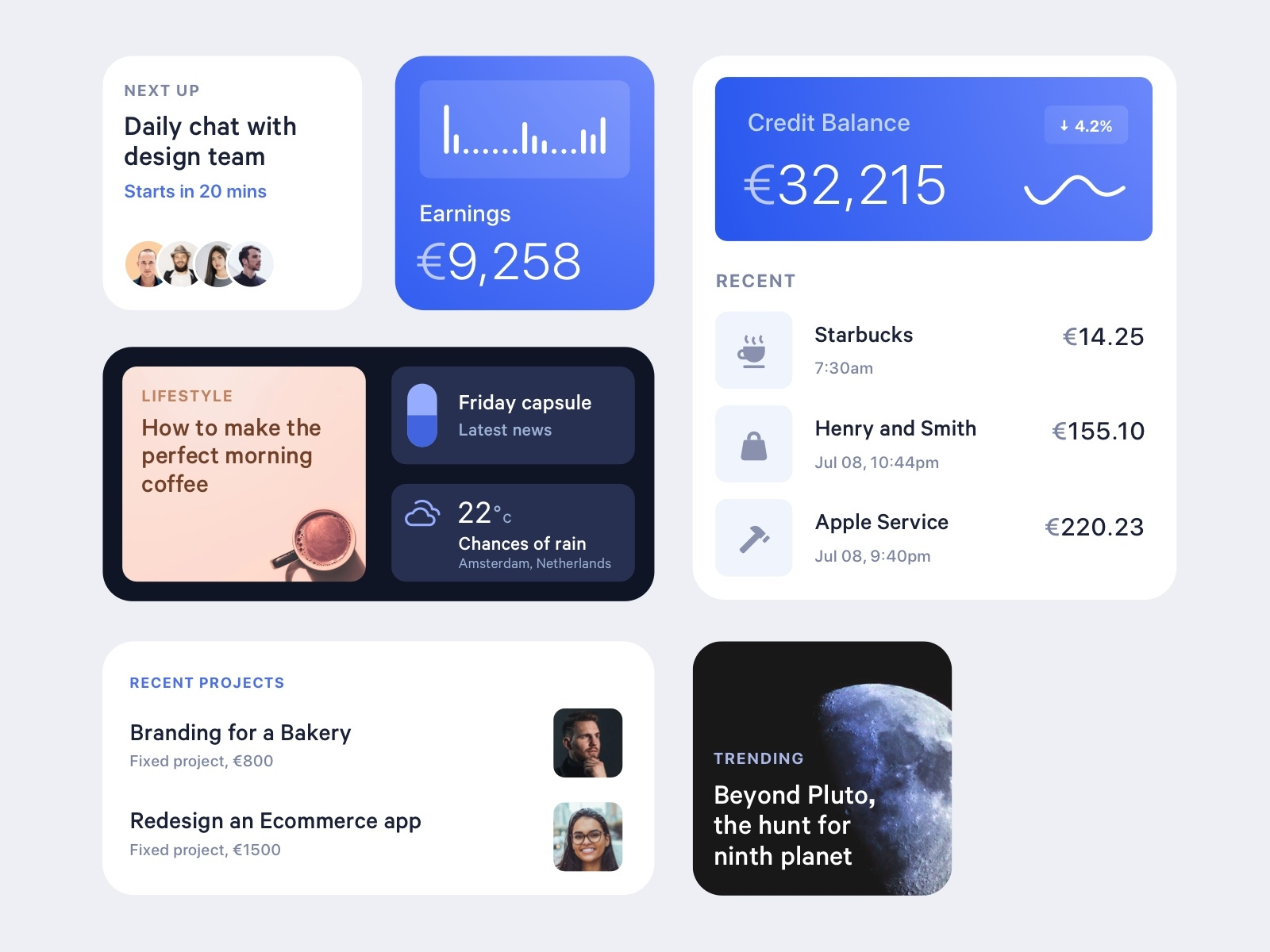
As we mentioned before, it’s important to enable our users to play with the data and the visualization. The user should be able to explore, filter and search. Get valuable information and insights from the visualization experience.
You can include different controls to enhance the user experience.
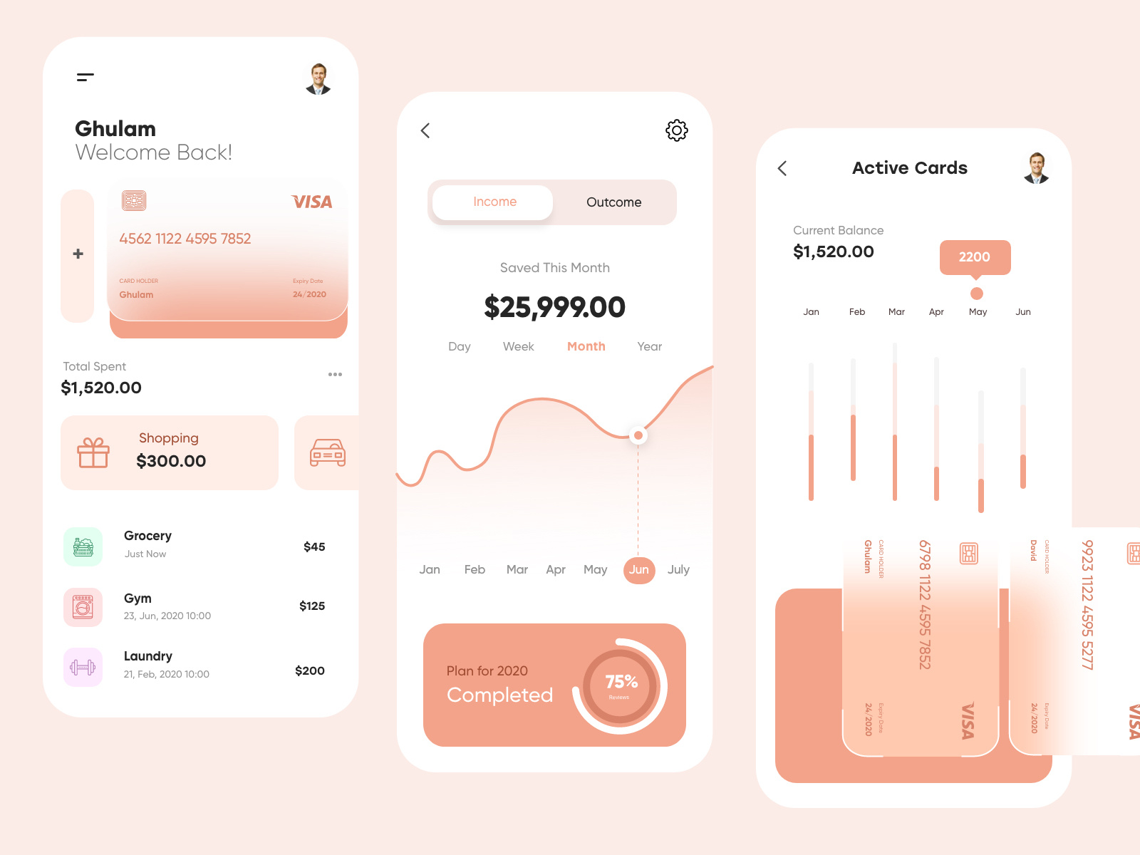
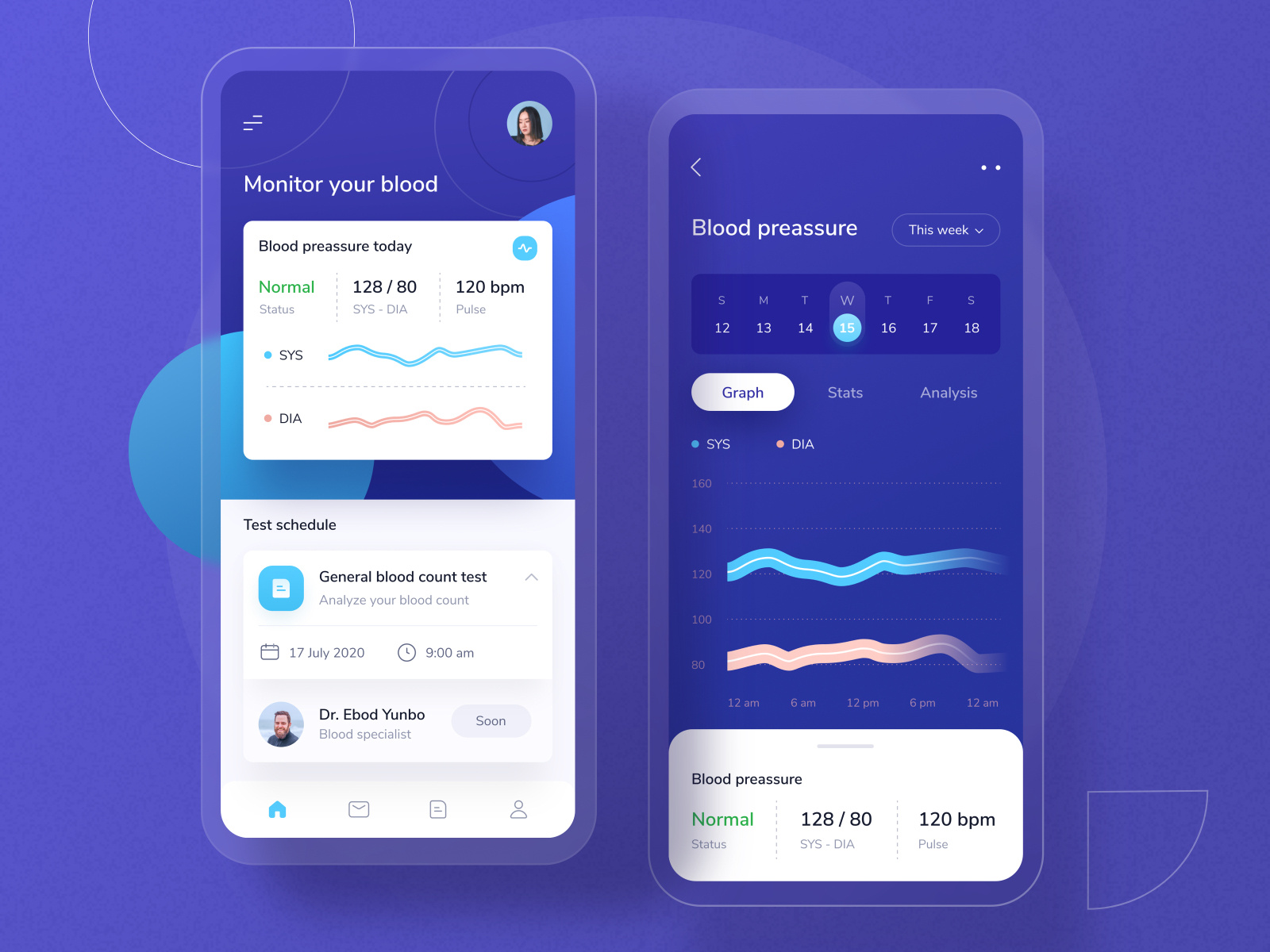
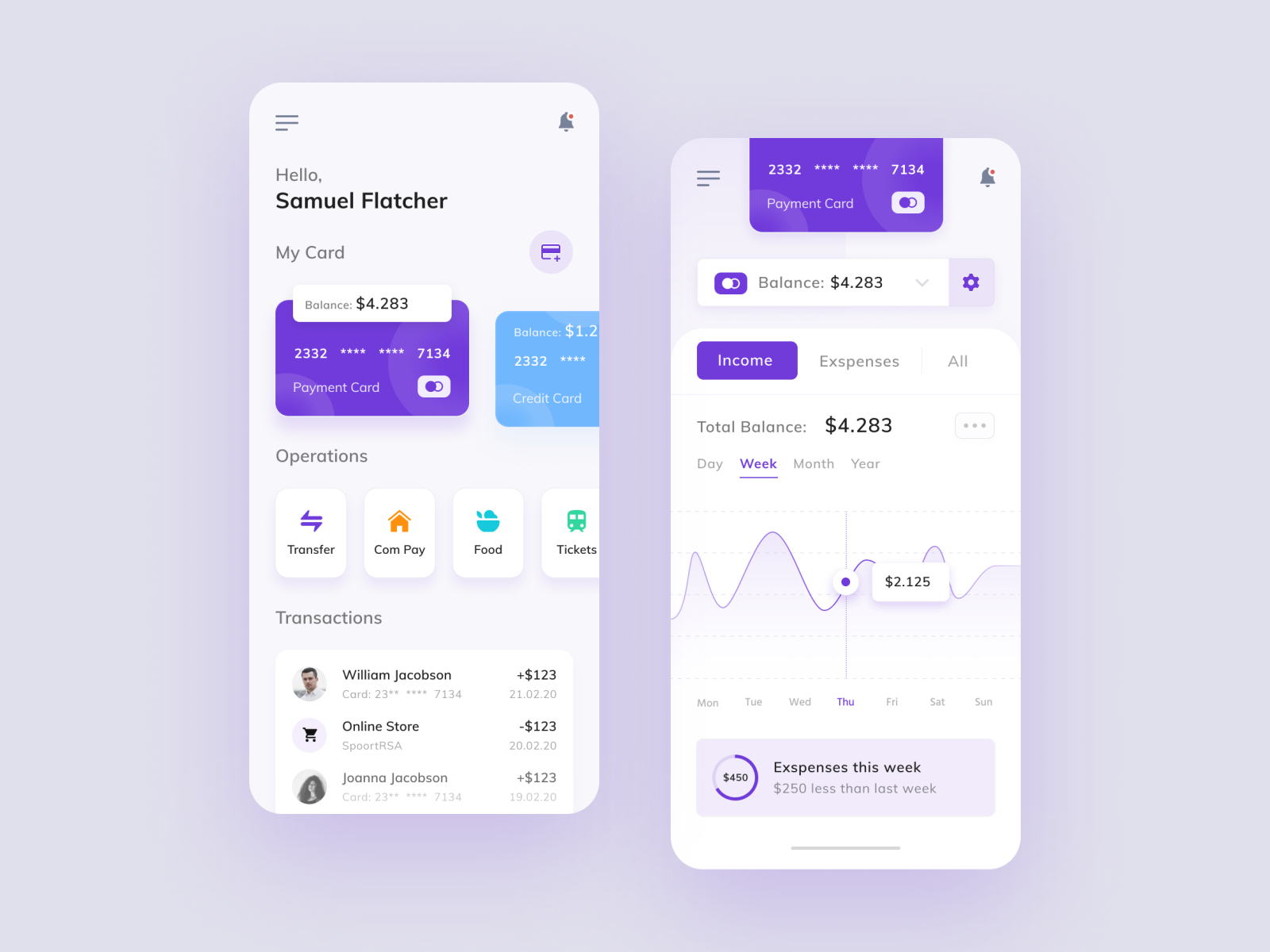
Like the previous examples, by adding interactions, we give more depth to the visualization and improve the value the user can get from our charts.
Sometimes, you need to target not just mobile devices but also tablets.
Maybe you are building a Progressive Web App and you must also consider desktop screens.
In these scenarios, you should think and design how the visualization will adapt to the available screen space.
Do you want me to keep writing tutorials and creating more advanced examples?
I have tons of knowledge to share with you.
I also want to write about things that YOU find valuable.
I will be experimenting with this new approach:
- I will create a list of topics that I suspect may be valuable to you
- I will start accepting small donations (aka: Buy me a coffee) as a signal of what content you find valuable
- Once a topic reaches 10 coffees I will commit to write a post, improve an existing one or build a code sample
How to be part of this experiment
- Go to my supporters page
- Add the link to the post + the topic you are voting for in the comments field when donating
It can be a topic from the pre-approved list or something related to that list that you came up with - If you are super enthusiastic about the topic, you can buy the 10 coffees yourself instead of waiting for others to join forces
- Also if you really love my content, you can buy me more coffees. This will reinforce my motivation to keep writing and teaching people.
Specifically, to expand this post, the topics I feel you may find valuable are:
- Code sample: A chart integrated inside a card
- Code sample: A combined visualization with a chart and a table
- Code sample: A chart with controls to filter the data source
- Tutorial: How to use Firebase as a real time data source for your chart
- Tutorial: How to use a Rest API as a data source for your chart
- Tutorial: How to build interactive charts (click, hover, etc)
When it comes to implementing visualizations and charts for your Ionic app, there are plenty of considerations before you start writing the first line of code.
We carefully reviewed many of the charting libraries available and shared our analysis on the top three Ionic Angular chart libraries.
In this post we exposed all the gotchas for you to make an informed decision and avoid underestimating the effort of building visualization use cases with Ionic.
Hope you enjoy the content, and consider supporting the effort if you want me to expand this tutorial.


Liked this Ionic Tutorial?
Leave your comments below.